What’s in a name? A lot of things, actually, if you own a business. In fact, 77 percent of consumers make purchases based on a brand name! In addition, other studies reveal that the shorter the brand name, the easier it is for customers, and potential customers, to remember your brand. Think about it, how many popular brands have 4 letter words in their name? Dell, Acer, Sony – they’re all big brands!
This only goes to show that if you’re planning on owning a business, think of a short name for your new brand, product or service. Also, you should definitely use a word count tool or character counter while you’re at it. Remember: brevity leads to memorability, which leads to brand recognition, which leads to more and more customers knowing about your brand. It’s that simple.
And if you need any help in keeping the name of your band short and simple, there are many tools in the market to help you determine the word count of your name. A word counter or character counter are some more popular ones, but there are many more.
Choosing A Business Name
Here is yet another reason why carefully pick the name of your company. It’s a pretty basic one – your company’s name is an important part of your product or organization’s brand identity. It’s the first thing people will notice about your brand. Plus, a company name or product name is key to building brand awareness.
Think about it, when you hear the word “Nike,” what thoughts and images appear in your mind? How about “Oreo,” or “Lego?” Did you notice a pattern? We did. Every day, more and more four-letter words, four-letter business names have gone from being nobodies to becoming household names.
Power Of The 4 Letter Business Name
Why four? Why not, two, three, or five? Perhaps it’s because four provide the perfect balance of brevity and wit. In just four letters you can tell what your company is about, without losing the attention of your audience. If we still haven’t been able to convince you to further illustrate what we mean, why don’t we check out a few successful companies with names made up of 4 letter words? (Well, we’re sure you don’t need a word counter for that!) Let’s start with Nike.
Nike
Source: Unsplash
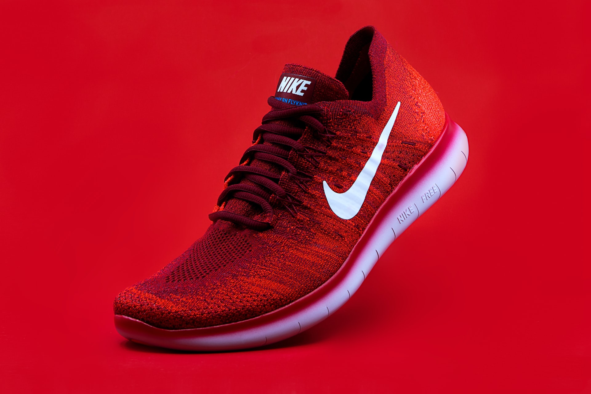
Nike is the world’s leading supplier and manufacturer of athletic shoes, apparel, and other sports equipment. In fact, there are over 1,000 Nike retail stores around the world. In a recent survey, over 50 percent of medium and high-income Americans revealed they own at least one item of Nike brand apparel, accessories, or footwear.
What is the secret of Nike’s success? Much of Nike’s success comes from the brand’s worldwide marketing campaigns, which use sponsorship agreements with celebrity athletes, popular sports teams, and college athletic programs to bring awareness to the brand.
Swoosh Logo
It wouldn’t get to where it’s at without another important piece of the puzzle – the company’s powerful and memorable “swoosh” logo. The iconic symbol played a huge part in getting the word out about the brand and establish strong brand recognition. We bet that if you ask anyone what the logo of Nike is, they’ll be able to describe it to you, in a flash!
How did such an iconic symbol come about? Well, it’s got quite an interesting story to back it up. You probably think brand application designers from top branding firms or advertising agencies collaborated to come up with the unique four letter word logo.
Story Behind The Swoosh Logo
But that couldn’t be further from the truth. Carolyn Davidson, a graphic design student, designed the Nike logo, made up of 4 letter words, in 1971, then eventually sold it to Nike co-founder Phil Knight for just $35! Regarding the origin of the brand name, Knight and the other executives named their company Nike after the Greek goddess of Victory, Nike.
Reverting to the story behind the iconic logo, did you know that the design of the Nike logo is a reflection of the arch of movement? The logo‘s first name was “The Strip,” but was later changed to “Swoosh,” after the sound we hear when something zips past us.
Truly, Nike’s brand story is proof of the power of simplicity. Simple in design and also simple in meaning, what began in the mind of a young student has successfully grown to be one of the most influential insignia in the world.
Oreo
Source: Unsplash
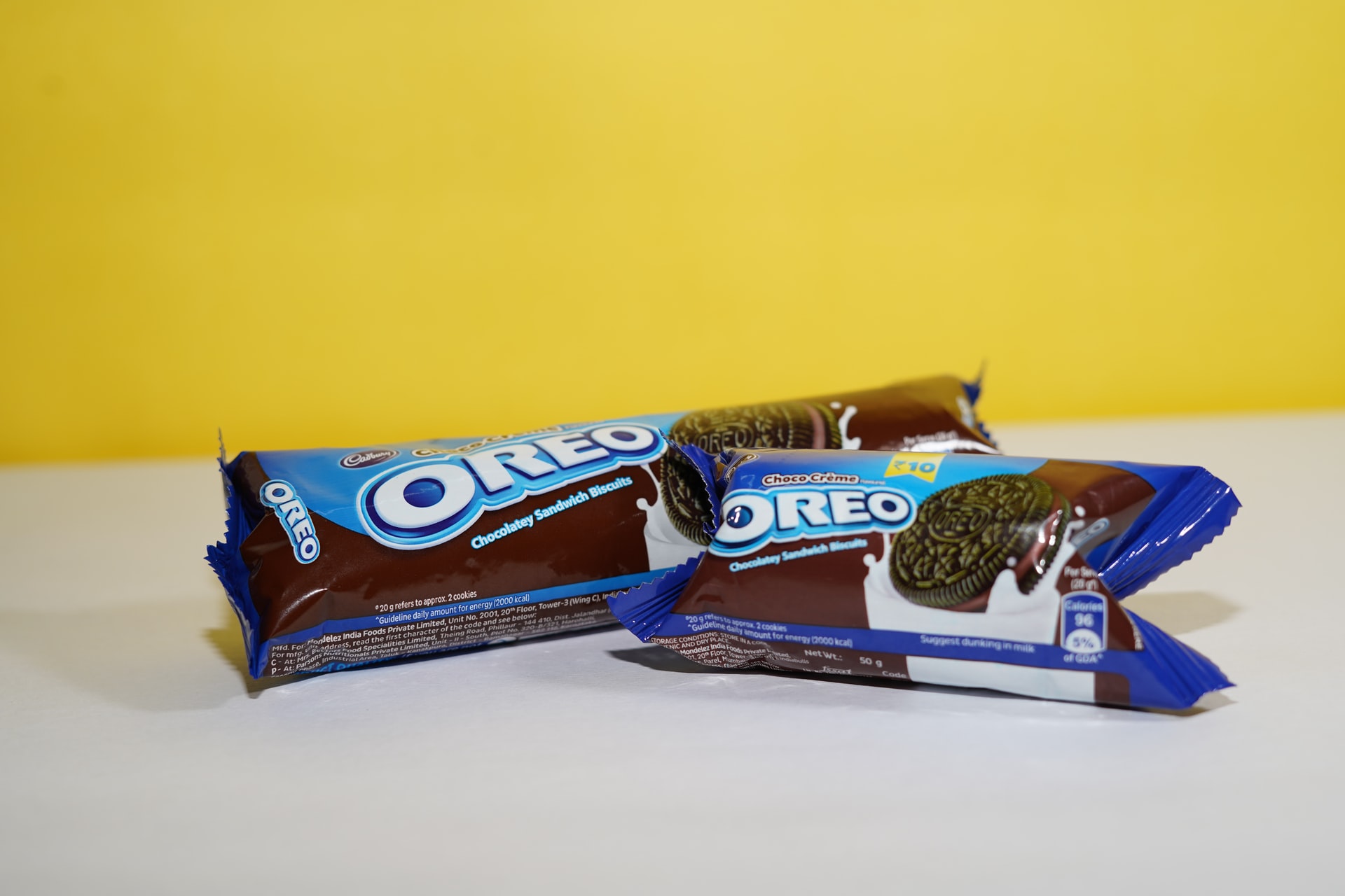
Oreo is the world’s top selling cookie brand. It was first introduced in the US back in 1921 and is currently available in over 100 different countries. America’s most enduring and most famous cookie has had a simple recipe for success: two chocolate cookies sandwiching one layer of yummy cream.
Origin Of Oreo
However, the story behind Oreo’s name is not as straightforward. There are many speculations about the origin of the 4 letter words o-r-e-o, some say the manufacturers got the name from the Greek word Oren, which means beautiful, nice, and well done, while others believe the cookie’s name came from the word “dore,” which means gold in French, which is the color of the original Oreo packaging.
If there is one thing we can be sure of, it’s that the commercial brand design of the Oreo logo has gone through many changes. After change after change, it’s most recent and quite possibly final revision occurred in 2001 after food and beverage Kraft Foods acquired Oreo manufacturer Nabisco.
Lego
Source: Unsplash
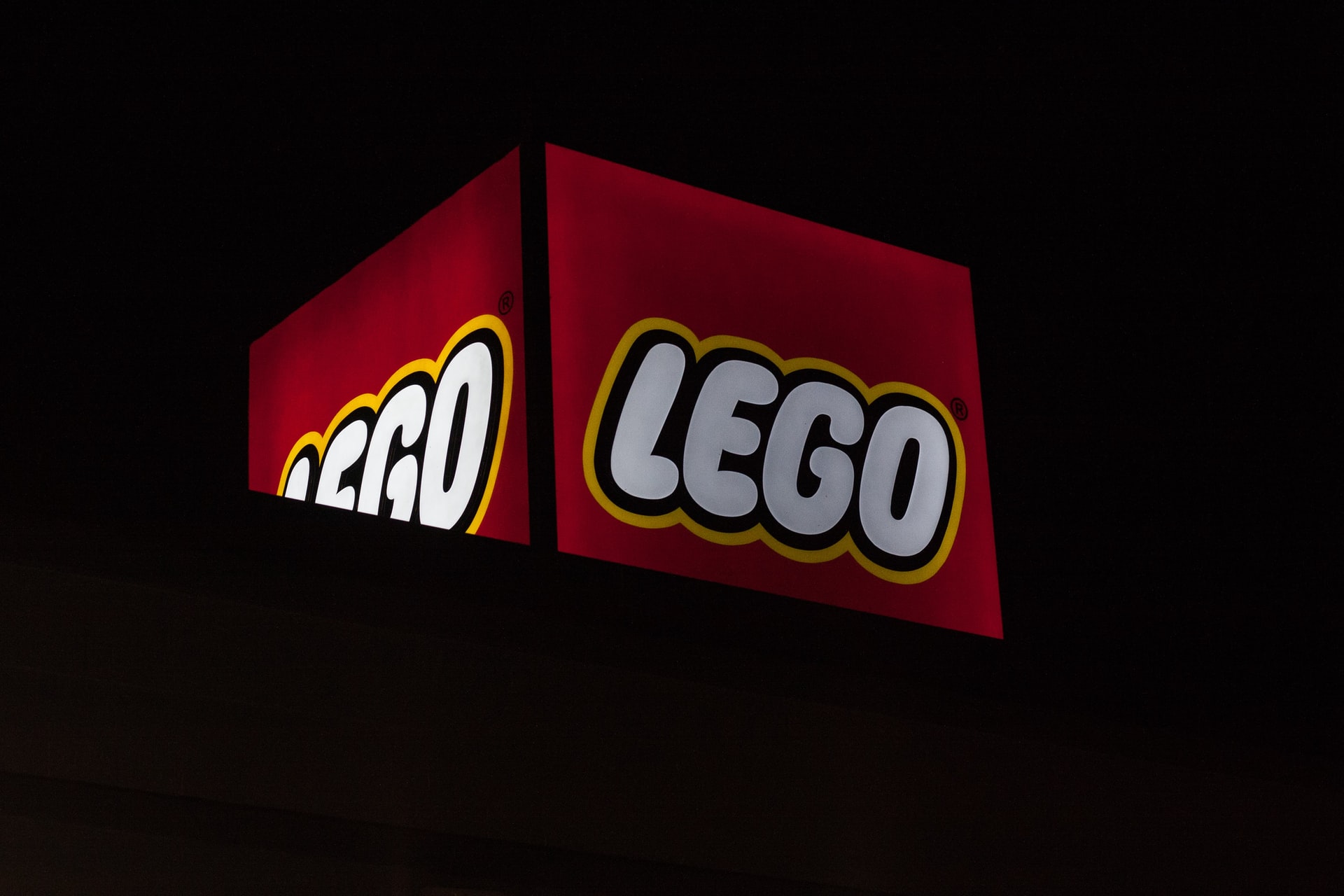
Lego is the most popular building toy on the planet. First released in the late ’50s, Lego toys have been played with by generations of all ages. Can you imagine a world without Legos? We know we can’t. Lego has been around for long, and has established itself so well, it’s hard to imagine a childhood without them.
The Story Of Lego
Lego is so big and so popular, the company earns a massive 1.24 billion dollars a year, just from toys! The toy company has come a long way from the time a Danish man by the name of Ole Kirk Kristiansen founded the group in 1932. The company was then passed on from father to son. Its current owner, Kjeld Kirk Kristiansen, is a grandchild of Ole Kristiansen, the company’s founder.
How did the name “Lego” come about? The company has a pretty simple story behind it – no surprise here – the 4 letter words in the company’s “Lego,” turned out to be an abbreviation of the Danish term “leg godt,” which means play well.
Lego Logo
Did you ever notice that the Lego logo is always seen in caps? Perhaps it is the only constant feature of the company’s visual identity. From the time it first entered the market, there have been over 15 revisions of the company’s logo throughout history. The first logo was launched in the year 1934, and it was made of the words “LEGO” all in black.
Another major change to the logo occurred over 10 years later. In the 1950s, when an oval style Lego logo with a red background appeared in the market. Following that revision, to promote a more playful look, Lego stayed with red and mixed it with black, white and yellow, releasing a logo in the ‘ 60s that looks similar to the present day one – a classic, fun font with vibrant hues.
If there was one thing Lego has taught us it’s this – work with colors and fonts that tie in with your brand message. Above all, don’t be afraid to experiment with the text, font, and design of the 4 letter words. You’ll never know until you try, right?
Coke

Source: Unsplash
The fourth brand on our list is Coke, a soft drink manufactured by The Coca-Cola Company, the biggest beverage company in the world. The Coca-Cola Company owns licenses and markets over 500 nonalcoholic beverage brands ranging from water to juice drinks, to ready-to-drink teas and coffees.
On any list, one brand’s got to come out on top – and in this list, Coke is the indisputable winner. How so? Out of all the beverage brands under the Coca-Cola Company umbrella, Coke is consistently number one in terms of revenue. In fact, in 2018, Coke sold nearly 29.6 billion cases of its product in a year.
Coke Story
A significant part of the success of Coke is associated with its striking logo design and catchy name. That said, who are we to thank for the catchy name and iconic logo of one of the world’s most popular drinks? A pharmacist from Atlanta, Georgia by the name of Dr. John Pemberton.
Pemberton concocted the original formula of Coke right in his backyard! His recipe contained cocaine, in the form of an extract of the coca leaf. This inspired the “Coca” part of the beverage’s name. After some time, Coca-Cola was shortened to the 4 letter words – Coke!
Coke Logo Name And History
Pemberton also designed the now world famous Coca-Cola script logo. He wanted the logo of his new product to have a timeless classic look with a modern flair, which is why, in creating the logo, he experimented with Spencerian, a popular script style. Little did he know that his creative process would bring about one of the most recognizable trademarks in the world.
Coke’s graphic designers revised the logo over 10 times after, experimenting with various hues and rearranging visual elements. The latest iteration of the Coca-Cola logo design, the one currently seen on all of Coke’s marketing and promotional materials, is a photograph of a red circle with four bottles inside it. Printed on top of the circle is Pemberton’s Coca-Cola logo all in white, and the words, “Taste The Feeling.”
Taste The Feeling
After seven years of using “Open happiness,” as the theme of campaigns for its flagship soft drink, the Coca-Cola Company switched to a new slogan “Taste the feeling”. This is to include all flavors part of the Coca-Cola family- Diet Coke, Coke Light, Coke Zero and Coke Life.
One thing we can learn from Coke’s design story is this – if you want to promote several product lines, the best way to deliver strong brand recall is by unifying all sub-brands under one master brand. You make it easier to remember your brand that way, and you’re giving your target market the message that with all the products you provide, there will always be something for everyone.
eBay
Source: Pixabay
American entrepreneur Pierre Omidyar launched one of the world’s most famous market places, eBay, back in 1995. What is the company about? eBay is basically an online platform that trades products on a local or international basis. Every day, people trade millions of items on eBay through online action formats, or auction-style listings. Currently, more than 100,000 small, medium, and large businesses sell their products as a part of eBay.
eBay Standing Strong
Despite the influx of competing e-commerce platforms Amazon, Shopify, Wix, and BigCommerce steadily saturating the online market, from the time it entered the market, to where it stands today, eBay has never faltered.
In fact, the online platform reported dramatically higher earnings and revenues this year, a record-breaking 664 million in revenue compared to its previous earnings of 310 million in 2019.
eBay Logo
In today’s crowded and competitive global market, with online stores popping up in every corner, how was eBay able to catch the attention of its target market and distinguish itself between other products and brands? The company’s iconic logo and unique, catchy name definitely helped in piquing the curiosity of many, prompting them to look and buy things from the site.
Here’s something that might surprise you – did you know that eBay’s CEO Pierre Omidyar wanted to call the site Echo Bay? Unfortunately, Canadian mining company Echo Bay Mines already registered the name. Omidyar wanted to name the site after a recreational area near Lake Mead, Nevada because he liked the sight and thought it sounded cool. Omidyar eventually shortened the name Echo Bay, and came up with the name eBay.
History Behind The eBay Logo
The logo of eBay experienced a bit of a more tumultuous journey. In 1997, the first eBay logo was born. The 4 letter words that made up the logo were written all in black, on a white background, with no frames or additional details. The inscription came in a bold typeface with elongated and distinct serifs. All the letters were all in caps, and the “B” was made to look bigger.
Two years later, the graphic designers of eBay brought a much-needed spot of color to the emblem. Each letter was in a different color and overlapped one another. eBay put in that style to represent the assortment and diversity of items you could find on the website.
In 2012, eBay changed its original logo and unveiled another logo, a slightly revised version of the previous one. The red-blue-yellow-green color palette remained untouched, but the font of the 4 letter words weren’t overlapping anymore. eBay redesigned the letters and gave them a more organized, more traditional kind of vibe, then placed the letters all in one line and glued them to one other.
During its announcement of the new emblem, eBay revealed they revised the new logo for another reason- to symbolize the improvements the site made in terms of customer experience. eBay came up with a cleaner, contemporary, and more consistent customer service, and the company wanted its new site to reflect that. By the way, can you guess who we should thank for such a striking logo? Lippincott, a well-known brand strategy and design company developed the logo.
Dare To Be Different
One of the most important things we can learn from eBay’s design story is that a good logo should dare to be different sometimes. Many times, people are drawn to interesting design and striking color, and eBay’s logo got all of that down pat. It is definitely one of most colorful and one of the most creative emblems in retail, and it’s got the attention of many of its current and potential customers, prompting shoppers to look, go into their site, and purchase the products in the site.
Conclusion
Owning a company with four-letter words in its name is great. However, it will never automatically mean that your business will be popular. You also need a striking and effective logo to represent your company because logos are like the front door of a business. They deliver the first impression, the first greeting, the first look of a brand.
If you want the logo of your brand to be successful, it should be immediately recognizable. It should also reflect your brand’s image, and most of all, it should command attention. It should be better than all your competitors in the best of ways.
To add to that, certain visual aspects of logos have a tremendous impact on how people interpret them. So when you’re coming up with a name and a logo for your brand, never forget to keep all of those things in mind.
And if you’re ever in doubt, reading this article again, relearning how the brands did it, will definitely help you refine your own products and connect with your audience. After all, if they can do it, we know you can!

